1. So..


    What's with the two blocks in the middle? Why no 'U2' or 'album title'? Or just the picture without the blocks?
  2. It goes with the equality stuff Bono's talking about, in fact, in the picture, half of it is sea and half of it sky, equally divided, then the sea is black and the sky is white, and the equal sign is right in the middle, one line in the sky one in the sea...for me it all points to equality between different kinds of people.
  3. Originally posted by Ali709:It goes with the equality stuff Bono's talking about, in fact, in the picture, half of it is sea and half of it sky, equally divided, then the sea is black and the sky is white, and the equal sign is right in the middle, one line in the sky one in the sea...for me it all points to equality between different kinds of people.


    Good explanation... I think it's just one of their best covers... much better than HTDAAB (:. )
  4. It's a grower
  5. Originally posted by Ali709:It goes with the equality stuff Bono's talking about, in fact, in the picture, half of it is sea and half of it sky, equally divided, then the sea is black and the sky is white, and the equal sign is right in the middle, one line in the sky one in the sea...for me it all points to equality between different kinds of people.


    Yeah - I'd have to agree with you on that one. The equals sign is also one of those picture-questions you sometimes get asked in IQ tests etc, where they ask you which line is darker. Your natural inclination is to say the top one as, based against the lighter background, it looks darker than the one below. Obviously both are the same shade & colour, it's just that the different backgrounds make for a different initial perception.

    Much the same as humanity I guess!!??
  6. At least it'll do something to the casual CD shop customer: As there's no information regarding artist/album titel, ppl will take it from the shelf to see who it is. Maybe some will think "Oh, U2....mh, great band, let's give it a listen/buy it".
  7. I like the one Casper made better but I think this is one of their best covers, anyway
  8. Or it goes with the numbers theme Bono was speaking about last year.

    = equals something.
  9. Very Radiohead (ish) & it's hard to work out a tour t-shirt (s) at the minute

    Achtung Baby is not on the front of that album too don't forget,U2 is though........
  10. It reminds me of R.E.M's New Adventures in Hi Fi, slightly. I don't think it's up there with Achtung Baby or The Joshua Tree but it's nice. Not having the band on the front cover is a good choice this time I think.
  11. Best cover they ever had, love the contrast. The empty-ness in the top, the full-ness below. It's epic and I think it totally fits the songs, after hearing that 30s-snippet of NLOTH. Too bad there are two blocks in the middle, but I guess Bono had a certain thought of it...And No Line On The Horizon means of course: Sea=Sky, the moment where these two worlds come together.

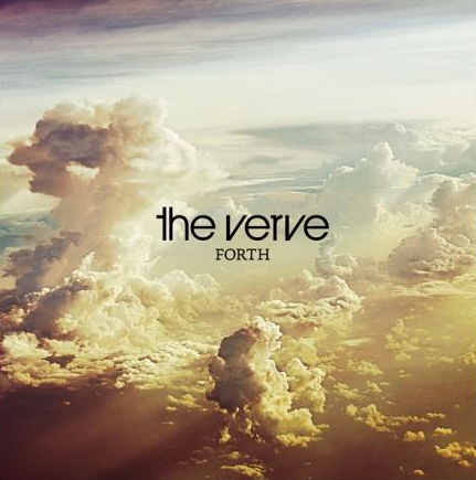
    And it makes me think of Forth by The Verve: