1. Also think the first one looks better, and it's the kind of photo I don't like to over-editing...Sunrises and sunsets are pretty awesome in all the ways if you ask me

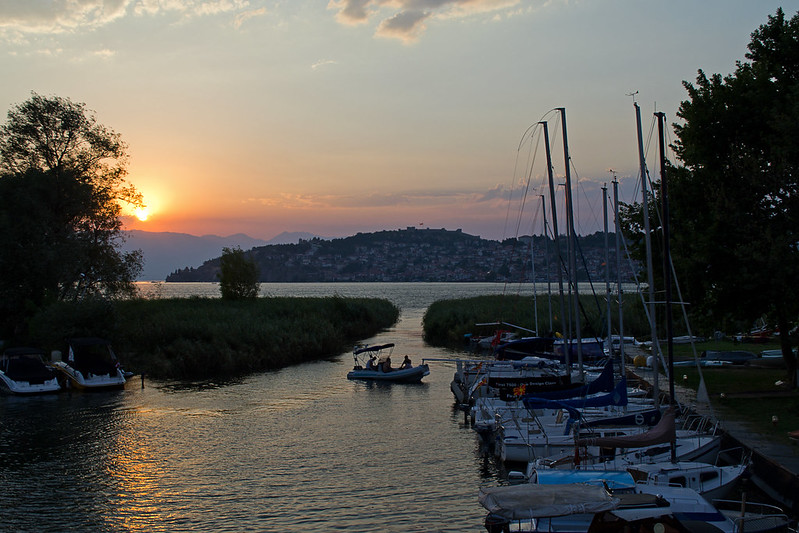
    Now, if you want to get all the light and colours at sunsets/sunrises, I suggest start doing some HDR photos. I tried a few while in NY and I've been editing them. The final result will look better than I was expecting. You just need some patience and maybe a tripod

    Finally, thanks for the words Chris
  2. Tried some HDR (on my phone) in the past, but it is difficult to keep the photo realistic.
  3. That's true...luckly my new camera has the HDR feature and it's easier to make the compositions with the pictures...Still prefer the normal photographing style though.
  4. I'm done. In the end, I didn't do an awful lot of editing. Re-adjusted the highlights/shadows and bumped the contrast. Adjusted the saturation (yellow, red, blue) and increased the sharpness. Also corrected the horizon to 359.2° and therefore extended the edges to 103% to make up for the angle adjustment.


    Because I adjusted some of it in the RAW editor, I've attached the updated .NEF file to the .zip archive along with the PSD and exported .jpg. So if you open the new RAW photo in Photoshop, you'll see my settings.

    Link
  5. And those photo's from New York are excellent Aidan!
  6. I am done with my photoshop, I made 2 versions since I cant decide if the latter one is an improvement or not.


    What I did is process parts independently, brought back the town a bit (which was underexposed) and made the sky a bit warmer (like you guys did) and the water a bit cooler.


    The difference between the versions is that in the 2nd one I didnt darken the grass but processed it separately to conserve the green. But due to the lack of color detail I am not sure if it works. From a distant it looks better, but if you look more carefully its a bit odd :/ Probably because I butchered the grass selection mask.

    I didnt bother to correct the horizon, since it doesnt bother me personally. But I will tell them next year their bridge is crooked

    The photoshop is uploading, its 300 MB since I have quite some layers. But as I said, I basically divided the photo in 3 parts and played with their colors independently.

    Aidan's sky together with my town matches reality the best. But as I said, I have a 'warm-color' fetish

    Edit:
    https://rapidshare.com/files/3508080735/DSC_0297.psd
  7. The town looks much better. I prefer the second one but that's because I like to have some detail in the foregound, I think that an almost complete silhouette forces the eye to just look at the town and the sky. Whereas having detail in the foreground allows you to look at more of the scene. I do sway towards reality and I don't think the scene would appear black to the human eye.

    I started another edit last night, but left it alone because I kept messing it up. I might return to it tonight.
  8. Was definitely not black for the human eye As I said from a distance I prefer the 2nd one but up close you can see a lot of editting mistakes :/
  9. Ok, I've uploaded the second attempt I began last night. This time taking each piece separately. Some obvious editing mistakes around the sails of the boats (in the sea), but it's so inticate there that it's a nightmare to edit perfectly. Also, don't get me started on the tree branches

    New:


    First Attempt (posted above):


    The new one I think has better colour in the sky and sea. I'm still not happy with the foreground, but the details on the boats stand out more in the newer edit, which I like. Safe to say though that landscape isn't my bread and butter.
  10. Definitely an improvement


  11. *two pages later*

    Maybe a new topic wasn't such a bad idea after all. I've got to go searching for the post about Sergio's new camera now.

    I just didn't think we should clutter the boards up.
  12. Well lets do next one in a new topic